When it comes to taking portraits, color is a powerful tool for creating impactful images. From choosing the best color palette for your background to using color to create a certain mood or atmosphere, the way you use color can make or break a portrait.
First and foremost, you want to choose a background that complements your subject’s skin tone. For instance, if your subject has a warm skin tone, you’ll want to choose a background with warm tones, such as yellow or orange. For subjects with cooler skin tones, you’ll want to choose a background with cool tones, like blues and greens. This will help create a harmonious look that brings out the best in your subject’s features.
You can also use color to create a certain mood in your portrait. For example, if you’re going for a romantic look, you might choose to use warm tones like reds and pinks. If you’re going for a more serious look, you might choose to use cooler tones like blues and greens.
Finally, you can use color to draw attention to certain features in your portrait. For example, if you’re shooting a portrait of someone with striking eyes, you can use color to draw attention to them. You might choose to use a bright color in the background that complements the color of their eyes, or you might choose to use a contrasting color to make them stand out even more.
By using color to create impactful portraits, you can make your images stand out from the crowd. From choosing the right background color to using color to create a certain mood or draw attention to certain features, color can be a powerful tool for creating stunning portraits.
Ten tips to bring life to your portraits:
1. Use a limited color palette to create a cohesive look and bring focus to the subject.
Using a limited color palette to create a cohesive look and bring focus to the subject can be achieved by selecting a few colors that complement each other and creating a base color scheme. Keeping the color palette to a minimum will draw the viewers attention to the subject and create a unified look. Additionally, using shades of the same color will also help to create a cohesive look. For example, if you choose to use a blue color palette, you can opt for lighter shades of blue in the background and darker shades of blue for the subject, bringing focus to it. Finally, make sure to use contrasting colors to add visual interest, like black and white, while still maintaining the limited color palette.
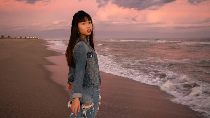
2. Use warm tones to add a sense of energy and vibrancy to your portraits.
Warm tones can be used to add a sense of energy and vibrancy to your portraits. To achieve this effect, try using warmer colors such as yellows, oranges, and reds in the background or clothing of your subject. You can also use a warm filter on your camera or photo-editing software to add a subtle warmth to your photo. Additionally, you can use natural lighting to your advantage by shooting in a warm location with plenty of sun. Finally, you can adjust the contrast and saturation levels in your image to give it a more vibrant, energetic look.
3. Use cool tones to create a calming and peaceful atmosphere.
Cool tones can be used to create a calming and peaceful atmosphere in your portraits. Start by selecting a cool and neutral background, such as a white wall or a light blue sky. Then, use a gentle, soft light to illuminate your subject. Select cool and muted colors for clothing and props, such as blues, greens, and purples. Avoid bright or warm colors. Finally, shoot your portrait in a relaxed environment and encourage your subject to be relaxed and comfortable in their pose. This will create a peaceful atmosphere in your portrait.
4. Use complementary colors to add contrast and visual interest.
Complementary colors are two colors that are opposite one another on the color wheel. When used together, they create a striking contrast that can add visual interest to your portraits. To use complementary colors, consider the hues of your subject’s clothing, hair, eyes, and skin. Choose a complementary color to the hue of your subject’s features and use it as an accent in the background. You can also use complementary colors to draw attention to certain elements in the portrait. For example, if your subject has blue eyes, you can use complementary orange tones to make their eyes stand out. Finally, you can use complementary colors to create a color scheme for your entire portrait. For example, if you choose blue as the primary color, you can use its complementary color, orange, as an accent color in the background or on props in the foreground.
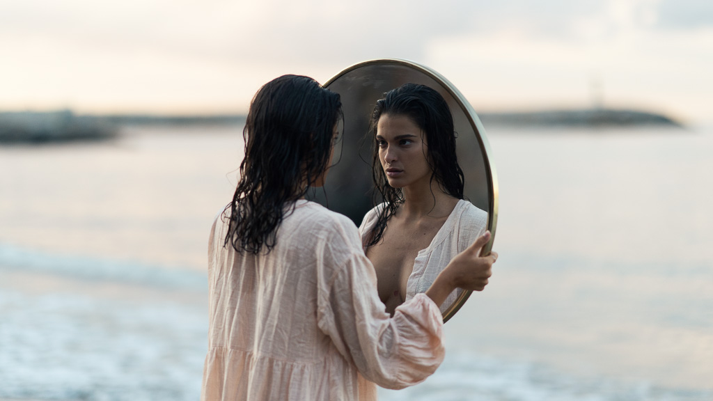
5. Use a monochromatic scheme to create a dreamy, ethereal look.
A monochromatic color scheme is a great way to create a dreamy, ethereal look to your portraits. To achieve this look, start by selecting a single color as your base. This should be a soft, muted color like pink, light blue, or lavender. Then, you can use various shades, tints, and tones of that color in your portrait. For example, you may use a light pink as the main color, and then use a soft lavender and a light blue to create accents and highlights. You can also add texture to your portrait by using a variety of materials with different textures, such as patterned fabrics or muslin. Finally, use natural lighting—such as window light or outdoor light—to create a soft, dreamy effect.
6. Take advantage of natural light to enhance the colors in your portraits.
Taking advantage of natural light to enhance the colors in your portraits is a great way to create stunning images. Natural light is a beautiful and versatile light source that will give your photos a unique look and feel. Here are a few tips to help you make the most of natural light when shooting portraits:
- Find the right time of day. Natural light changes throughout the day, so it’s important to find the best time of day to shoot. Early morning and late afternoon are usually the best times to take advantage of the soft, warm light of the sun.
- Look for open shade. Open shade is an area that is shaded from direct sunlight, but still receives plenty of light. This type of light provides a soft and even light that can be used to create beautiful portraits.
- Avoid direct sunlight. Direct sunlight creates harsh shadows and can be too bright for portraits. If you must shoot in direct sunlight, try diffusing the light with a reflector or a diffusion panel.
- Use the color of the light. Natural light changes color throughout the day, from warm oranges and yellows at sunrise and sunset to a cooler blue during the day. Use this change in color to your advantage and experiment with different hues in your portraits.
By taking advantage of the unique qualities of natural light, you can create beautiful and engaging portraits that are full of vibrant colors. With a little practice and experimentation, you can create stunning images that will wow your audience.
7. Play with color temperature to create an atmosphere of drama or serenity.
When shooting portraits, color temperature is an important factor to consider when creating an atmosphere of drama or serenity. Color temperature is measured in degrees Kelvin and is usually referred to as “warm” or “cool”. A warmer color temperature will give a portrait a more dramatic look while a cooler color temperature will give a portrait a more serene look.
The color temperature of a scene can be manipulated either by changing the lighting or by adjusting the white balance settings on your camera. If you are shooting with natural light, then you can use a warming or cooling filter to change the color temperature.
To create a more dramatic atmosphere, use a warmer color temperature. This will make the colors in your portrait appear richer and more saturated. It will also give the portrait a slightly orange or yellow hue.
To create a more serene atmosphere, use a cooler color temperature. This will make the colors in your portrait appear softer and less saturated. It will also give the portrait a slightly blue or purple hue.
It is important to remember that the color temperature you choose should be appropriate for the mood you are trying to create. Generally, warmer color temperatures are better for creating a more dramatic atmosphere while cooler color temperatures are better for creating a more serene atmosphere. However, it really comes down to personal preference and experimentation. So, don’t be afraid to play around with different color temperatures to find the one that works best for you.
8. Use color to emphasize the mood of your portrait.
Color is an incredibly powerful tool in expressing the mood of a portrait. By carefully selecting colors and using them judiciously, you can create an emotional impact that can make a portrait come alive.
The first step is to decide what mood you’d like to create. Do you want to create a warm, inviting feel or something more somber? Once you’ve decided, you can start selecting colors that will help express that mood.
Warm colors such as yellow, orange, and red can be used to create a feeling of joy and happiness, while cool colors such as blues and greens can be used to create a more subdued and peaceful atmosphere. You can also use colors to add contrast and draw attention to certain elements of the portrait. For example, a bright, bold color can be used to draw attention to a focal point, while a muted color can be used to subtly draw the viewer’s eye to the background.
In addition to choosing colors, it’s also important to consider the tone of the colors. Warm colors can be used to create a feeling of warmth and comfort, while cool colors can be used to create a feeling of solitude and serenity.
Using color to express the mood of a portrait is a powerful tool that can help bring your work to life. By carefully selecting colors and using them to enhance the mood you’re trying to create, you can create a portrait that’s truly unique and emotive.
9. Consider the season when choosing colors for your portraits.
Choosing the right colors for your portrait photography can be a daunting task. However, if you think about the season in which you’re shooting, you can make sure that you’re selecting colors that will make your portraits even more beautiful.
During the winter, you can opt for cool tones like blues, purples, and greens. These colors will give your photos a cozy and inviting feel. For spring, choose warm colors like oranges, yellows, and reds. These colors can help bring out the vibrancy of the season. In summer, opt for bright and bold colors like pinks, purples, and blues. These colors will help create a vibrant and fun atmosphere.
For fall, you can choose rich and earthy colors like browns, oranges, and reds. These colors will help create a cozy and inviting atmosphere. No matter what season you’re shooting in, you can find colors that will help enhance the beauty of your portrait photography.
Take the time to consider the season when selecting colors for your portraits and you’ll be sure to capture stunning shots no matter the time of year.
10. Have fun with color and use them to create a narrative.
Using color in portrait photography is a great way to create a narrative for your photos. Whether you are shooting a series of portraits or a single image, adding color can help to create a mood or tell a story.
When it comes to incorporating color into your portraits, the possibilities are endless. Explore the use of complementary colors, monochromatic color schemes, and bold primary colors to create a narrative. Color can be used to draw attention to specific elements in the image, to direct the viewer’s eye, or to evoke certain emotions.
If you’re looking for a fun way to use color in your portrait photography, try experimenting with various color filters. These can be used to enhance colors in the background or to create interesting color effects. You could also try adding colorful accessories such as hats, scarves, and jewelry to add a splash of color to your photos.
Color can also be used to create a sense of cohesion or continuity in a series of portraits. For example, you could use a consistent color palette throughout the series, or you could use different colors for each portrait to create a unique narrative.
Ultimately, the most important thing to remember is to have fun. Experiment with color and don’t be afraid to push the boundaries. With a little creativity, you can use color to create a unique and compelling narrative for your portraits.