
Colors play a big part in photography. They help to represent the mood of a scene and make an image look more appealing. However, using colors that don’t complement each other can result in a photograph that looks flat and uninteresting.
Color harmonies are pleasing to look at, and the colors work together very well. However, the photos that grab our attention more often use a selected set of colors. There are different ways to create these sets:
Color Wheel
The color wheel is a circular color space that helps visual artists find a harmonious and pleasing color to create schemes and palettes with those combinations. The color wheel is divided into 12 sectors, each representing a specific color. These 12 colors are the same in any modern color wheel. A color wheel is a tool for selecting harmonious colors. It is also called a color circle.
Monochromatic Harmony
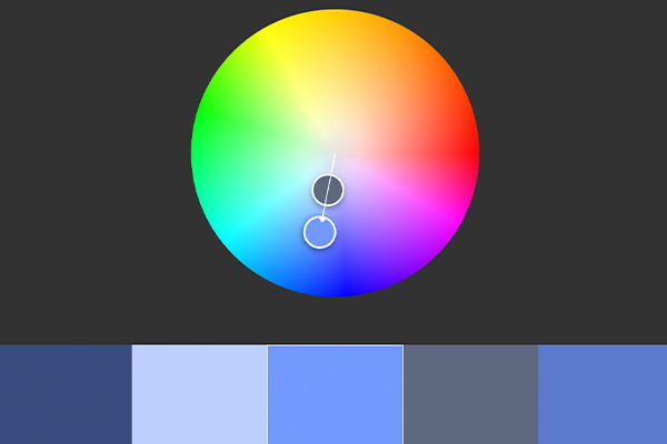
Monochromatic harmony is one of the many types of color harmony that you can use to guide you in your color selection for any project. It is pleasing to the eye as it contains different tones and tints of the same hue. Monochromatic harmony is very often used in cinematography, as it is a type of color harmony that you can apply to any color and is very popular in photography. It can create a fascinating effect.
Analogous Harmony
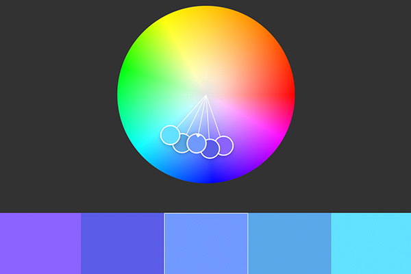
Analogous colors are colors that are next to each other on the color wheel. They usually create pleasing and relaxing visuals.
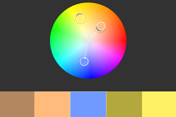
Analogous Complementary Harmony
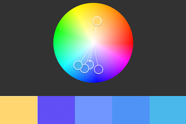
Analogous, complementary color harmony is slightly different from the typical analog harmony because it includes hues directly opposite each other on the color wheel. This scheme can create a warm or cool effect by adding an accent color that contrasts with the overall palette.
Complementary Harmony
Complementary colors are those that are opposite each other on the color wheel. Using two complementary colors, you can create a vibrant, high-contrast look, especially when working with full saturation.
Split complementary Harmony
Split complementary color harmony uses the base color and the two colors adjacent to its complement, which creates a strong visual contrast while avoiding the tension that can be present in complementary color schemes.
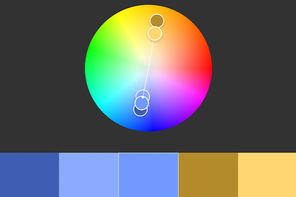
Doble Split Harmony
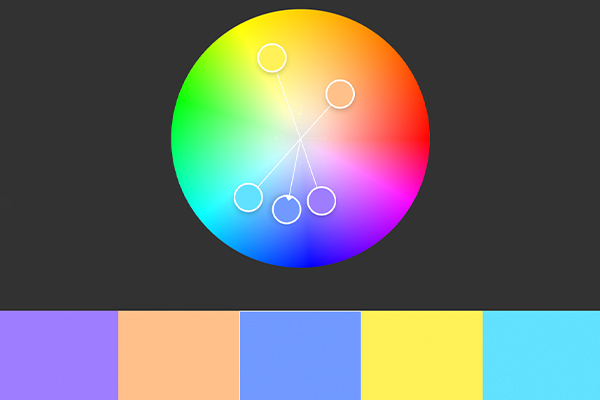
The Complementary double scheme has two pairs of colors that sit opposite each other on the Color wheel. This scheme provides a lot of contrast while still being harmonious. You can use it in fashion photography.
Color harmony schemes are a fantastic way for photographers to level up their images. It is an essential part of a photographic style, and many photographers use it. We hope you will use this information to help you create better images.